Want to see how the government spends your tax?

Have you ever wanted to know how the tax you pay every year was spent? Well, I have, and this year I found out.
After lodging my tax return online and actually receiving my return, I was lucky enough to find out exactly where my tax went thanks to a letter I received from the ATO.
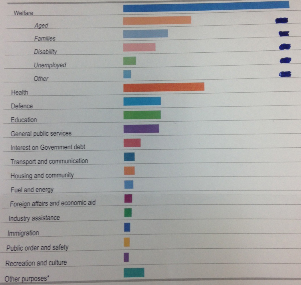
Basically, the below image is exactly how my dollars contributed to the growth and funding of Australia. I have hidden the dollar values however you can very easily see the bar chart.
I was surprised that welfare is so high. I understood that our welfare system was costing us a lot, but I didn’t realise just how much. I was also surprised at how little funding areas like fuel and energy and housing and community receive.
I understand that there is limited funds in the Australian economy and the government can only “play” with so much money, but after looking at this I can’t help but wonder, how can we invest in areas like education, health and public order and safety when there is no where to take money from other than welfare? When we look at this chart and see that aged welfare and health spending are the highest of all funds, it makes the governments concerns about funding our future very real.
So today, I want to know how would you like your tax spent? Where are the areas you believe receive too much funding and where would you like to see more funding go into? Answer the two poll questions below and lets see where we’d really like our money to go…
[polldaddy poll=8224866]
[polldaddy poll=8224867]


 Proudly Australian owned and operated