Cancer is the leading cause of death in Australia, with more than 48,000 people expected to die as a result of the disease this year.
With more than 138,000 new cases of cancer to be diagnosed in Australia by the end of 2018 — prostate, breast, bowel, melanoma and lung cancer make up 60 per cent of those diagnoses — a new cutting-edge Australian Cancer Atlas has been created so Australians can discover the impact of cancer in their own suburb or town.
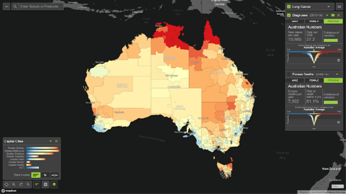
The new interactive digital cancer atlas shows national patterns of cancer cases and survival rates for 20 of the most common cancers in the country. This data reflects the characteristics, lifestyles and access to health services in the area.
The project, led by researchers from Cancer Council Queensland, Queensland University of Technology and FrontierSI, will give health agencies and policy makers a clearer understanding of cancer by using sophisticated statistical models and spatial analysis to look at data from each state and territory. Furthermore, information will be updated regularly, giving Aussies access to the latest information about their suburb or town.
Read more: Cancer testing may seem annoying and intrusive, but it could save your life
“This project builds on years of work by Cancer Council Queensland to better understand the cancer divide between metropolitan and rural areas, and map the gaps linked to socio-economic status and other demographic factors,” Cancer Council Queensland CEO Chris McMillan said in a statement.”

The atlas will give people a better understanding of the risk factors that contribute to cancer, including lifestyle factors, behavioural factors and genetics.
“The atlas enables readers to easily visualise those differences and offers critical insight into patterns of cancer and outcomes in Australia, depending on where people live, which can be used to drive research and policies going forward,” McMillan added.
Australians can use the atlas by filtering down and looking at the impacts of various types of cancer in their local area. Experts warn that while this tool can be useful, it doesn’t necessarily reflect a person’s own cancer risk.
“Cancer rates vary across geographic regions depending on things like the age of local residents, participation in screening programs and trends in terms of cancer risk behaviours,” Cancer Council Queensland Head of Research Joanne Aitken said. “Regardless of what is happening in our local area – we should each feel empowered to reduce our cancer risk by not smoking, being SunSmart, maintaining a healthy weight, reducing alcohol intake, exercising regularly, eating a healthy diet and getting checked.”
Read more: Top of world chart: Half of all Australian men likely to get cancer
The map uses colour coding to give users a clear view of cancer rates across the country as a whole, by state or by suburb. Cancer currently costs the direct health system more than $4.5 billion a year, with people living in remote parts of the country 120 per cent more likely to die from all cancers combined.
The atlas can be viewed via the website here.