
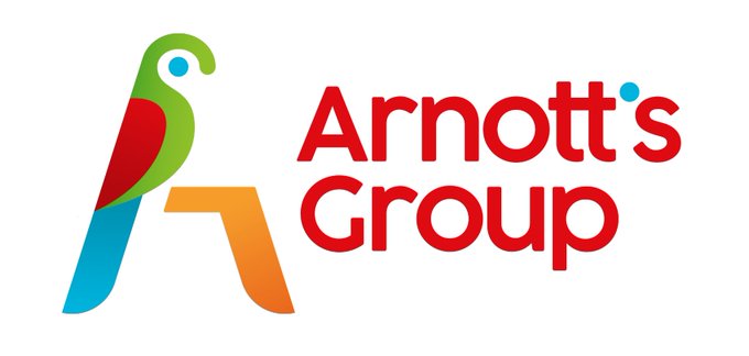
Arnott’s has come under fire after the popular biscuit company launched a brand new corporate logo, with many people branding it “soulless” and comparing it to a “decorative bread knife”, while others are calling for the company to “bring back the real parrot”.
The new branding sees the traditional parrot swapped for a more modern version, and the countless biscuit packets scraped. Arnott’s said the new look was designed “to express this next generation of the business by capturing its proud history“, news.com.au reports. However, the new design will be used for corporate purposes only, with the old logo that is currently on everyone’s favourite biscuits not changing.
“We have a fantastic legacy, a strong business and a plan for growth by building a world-leading group of businesses from right here in Australia,” Arnott’s group CEO George Zoghbi said
He continued: “A big part of our strategy will be investing in our people and products while minimising our environmental impact and supporting the communities in which we operate. Our strong performance and the launch of our new corporate brand identity is laying the foundations for our continued growth in Australia and beyond.”
However, the new design has left many Aussies underwhelmed, with one Twitter user named @thesheika saying: “it looks like a logo for an accounting firm”.
Meanwhile, @thisisdiego added: “No! The detail and colour in the original drawing is amazing. Sometimes companies change the logo, get publicity from a public outcry, then revert to the original. Let’s see if it happens with this one as well.”
And @sarahfrancis66 wrote: “Why is everyone so intent of trashing their history? This new brand is soulless. #bringbacktherealparrot.” User @Davidramli also added: “Parrot? Or decorative bread knife slicing through some crust?”
However, some Twitter users like @expectopposite are in favour of the change. “The original is great but this new design is fresh, clever and modern,” she said.
The news comes after Australia’s infamous and costly new wattle logo that was immediately compared to the coronavirus has now been scrapped and is being “redesigned” by the Morrison government. The Australian confirmed that the initial logo design that cost taxpayers a whopping $10 million is now under the process of being “reworked” but will continue to use the Golden Wattle theme. The new logo was originally replacing the old “Australian Unlimited” logo which had two orange boomerangs in the shape of a map of Australia while the iconic Australian Made kangaroo logo was also updated to a new darker version.


![]()
 Proudly Australian owned and operated