New Qantas logo sparks online criticism

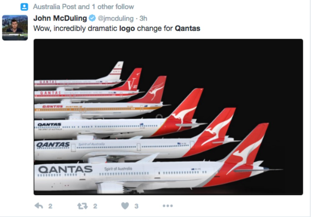
For just the fifth time in the company’s 96-year history, Qantas has decided to give their logo a makeover.
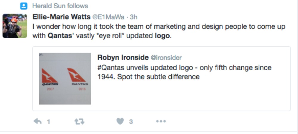
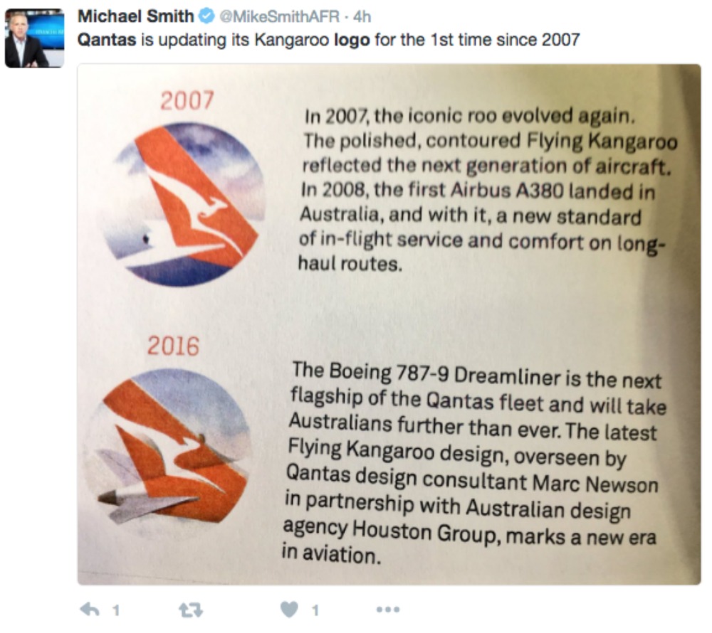
But if you compare the two, you might not notice much of a difference. That’s the criticism many people have about the logo after its unveiling this week.
Not only has the iconic flying kangaroo been altered, slightly, but the typography has been changed, too.
Read more: Air New Zealand slammed for not taking safety seriously
Qantas consultant designer, Marc Newson, along with Australian design agency, Houston Group, were responsible for the change.
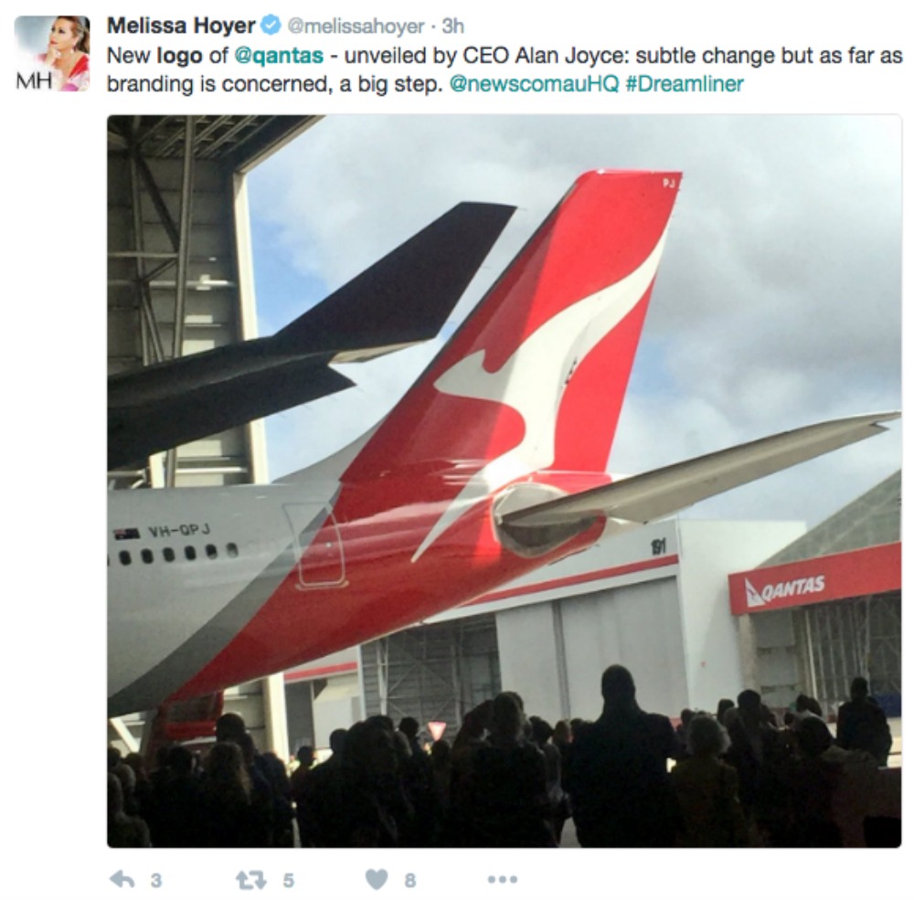
The new brand was unveiled on the tail of a new airbus that is to be launched next year.
“Aircraft tails are fantastic canvas to work on and the Qantas logo is one of the most recognisable in the world,” Newson said in his announcement.
“This re-design aims to retain the fundamental essence of the flying kangaroo but also move the brand forward.
A new streamlined look to the logo, as well as shading behind the kangaroo, gives the imagery depth, movement and a sense of luxury, Newson said.
Read more: This food reviewer shares which airlines have the best inflight meals
“A silver band now extends from the tail to the rear of the fuselage, to give a more premium feel.”
“The typography for the word Qantas, which measures almost two metres high on the 787, has been carefully streamlined. And Qantas will appear on the aircraft’s belly, so you can tell when it’s the national carrier flying overhead.”
Not everyone’s happy about the changes made to the iconic brand, though, with some taking to Twitter to share their thoughts.
1. First of all, not everyone understood what all the fuss was about:

2. They questioned how much the designer actually got paid for such a minor alteration, too:

3. Then some sarcasm was unleashed:

4. And some people questioned how long such a design actually takes to create:

5. While others wondered whether the money spent on creating a new logo could actually be invested into other areas:

6. But there were some who were impressed by the change:

7. Can you tell the difference?


 Proudly Australian owned and operated