
Are you confused by the vast array of tablets and potions available at your local chemist or even your local supermarket in many cases these days? All the manufacturers are vying for your custom, trying to kid you that theirs is much better than their competitor’s, curing your pain faster, clearing up that rash without fuss or stopping a cough in its tracks, as if turned off with a switch. But if you take the trouble to examine their packaging carefully, you will most likely find that they are all actually selling the same drug, under their own fancy brand name!
Take for instance that wonderful pain reliever we nearly all use, whether for a headache, a toothache or a bruised finger: paracetamol. You can get it under the name of Panadol, Panadene, (when codeine is added), Panadol Osteo, Sandoz, Astrix, Panamax and many others, but they are all basically a 500mg dose of paracetamol!
In my opinion, the manufacturers are allowed to get away with kidding their customers that they are selling something, which they are in fact not. Shouldn’t what the product is be at least, if not more, important than the name of the company, instead of the way things are in some cases at the present time? You actually have to search to find out what you have in the pack in some cases, the name of the drug is little more than a six-point note at the base of the box, swamped by the company name and the “message”!
I believe all manufacturers, should be compelled to give pride of place to the actual name of the drug, with their logo and title coming a distinct second. I’ve taken one of the manufacturers products to use as an example; Sandoz, in fact one of the better companies when it comes to naming the drug being sold, but I believe even their packaging could be improved. Here is their existing pack, for 100 paracetamol tablets:
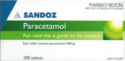
This is actually a nice design, with the product name quite clear, though still secondary to the name of the company. I have produced a rough design, which I hope bears out the point I’m trying to make:
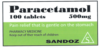
The message is still quite clear, but there can be no doubting what the product is, how many tablets are contained and what their strength is, and the company name is still quite prominent, but the relative importance of the various messages contained have been altered, and I believe become more understandable. I’m not trying to say my design is better than the original, because I don’t believe it is. That wasn’t the point I was trying to make, it’s just that change of emphasis!
The problem doesn’t seem to arise so much with prescription medicines, I guess because the pharmaceutical companies advertise directly to doctors, with leaflets, samples, etc., and the patient isn’t looking for something off the shelf for whatever ails him either in this connotation, he’s taking what his doctor has recommended and given him.
I can’t help thinking we’d become much more aware of what we are taking and what their differences are, if there are in fact differences, which I doubt. And of course this engineered confusion about the contents of pill boxes and bottles of fluid doesn’t apply just to paracetamol; it applies to many other products too, like cough medicine, most of which is codeine.
All the pharmaceutical companies supply almost exactly the same thing in whatever product they produce, but they try very hard to make us think they are different, and I don’t think that is fair to the customer, in such an important issue as personal health!
So what do you think? Should manufacturers concentrate more on letting the consumer know what they’re getting, rather than who is providing it?
Explore More
Book Confidently With Us


Pay safely with us


![]()
 Proudly Australian owned and operated